Typeface, fonts and zine, 2019
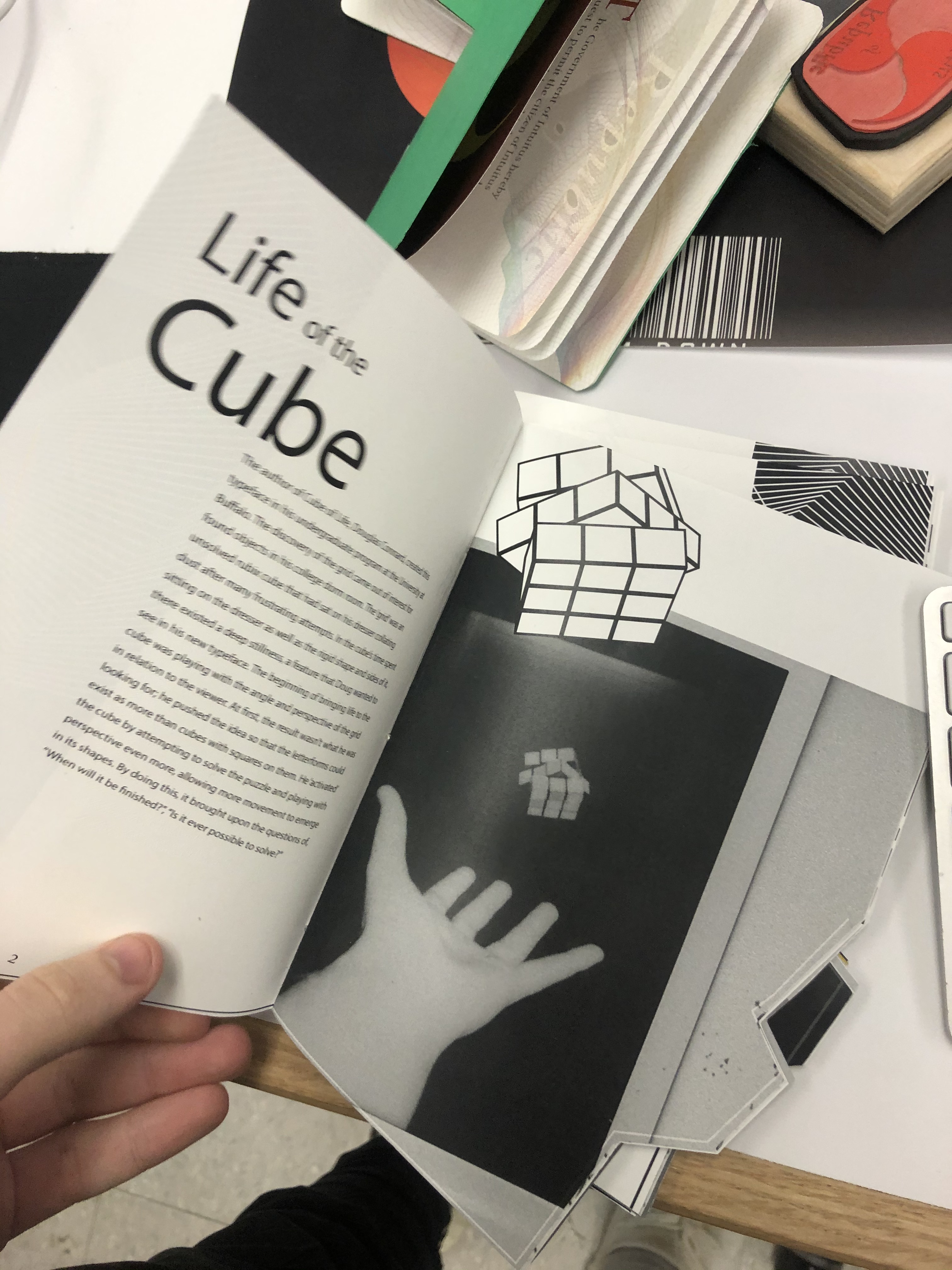
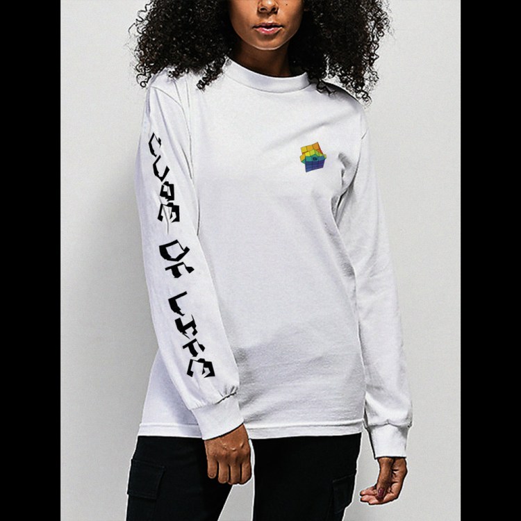
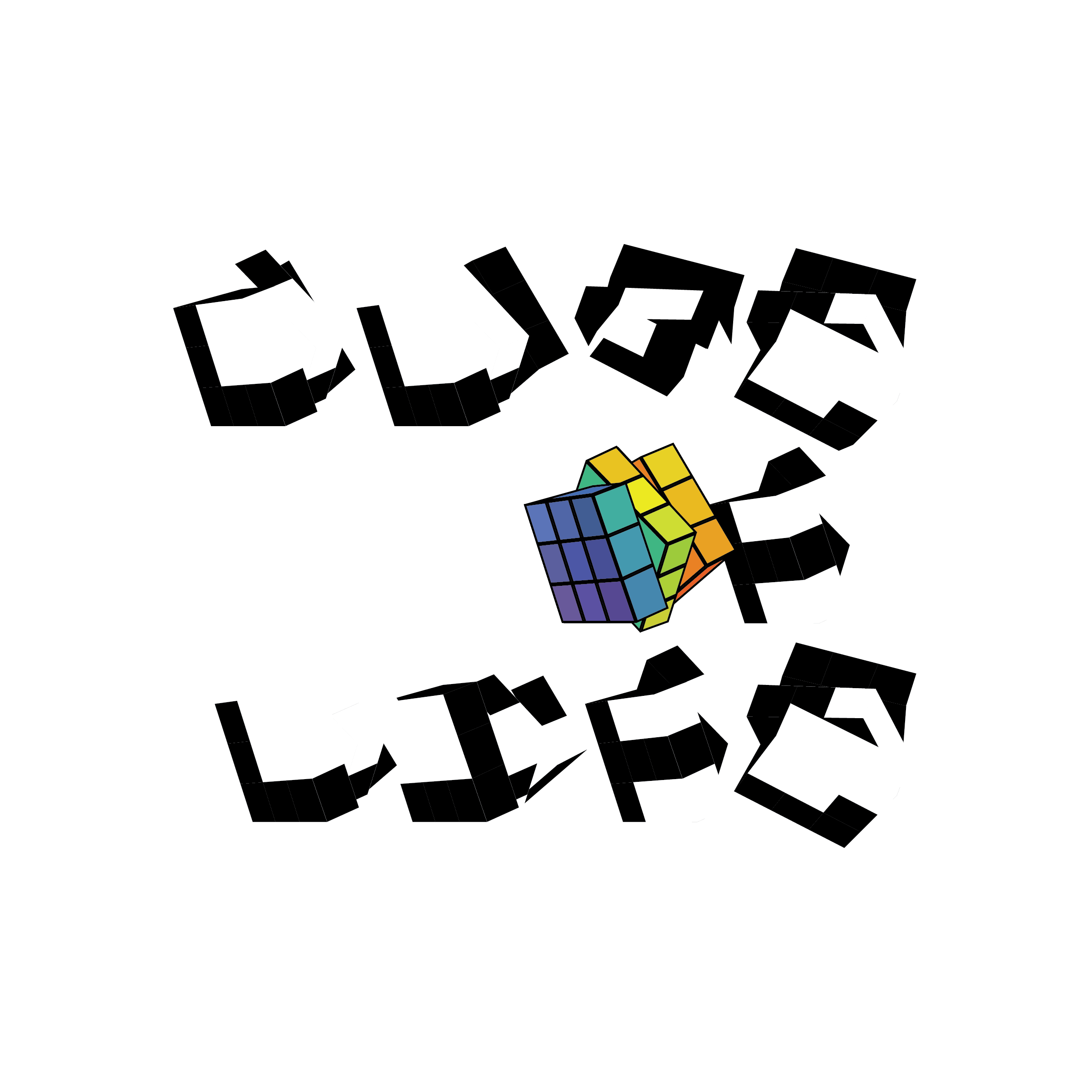
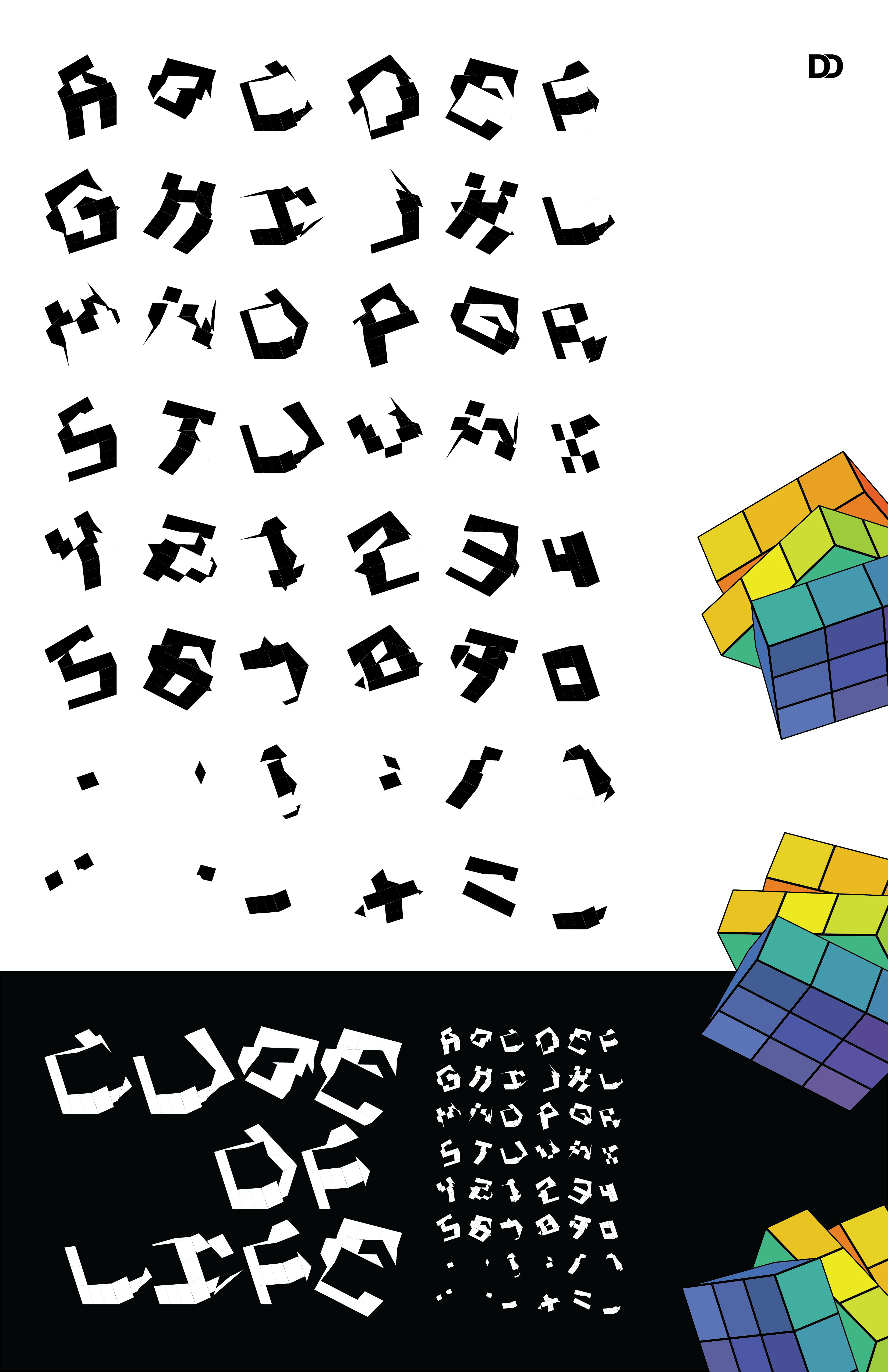
Life of the Cube
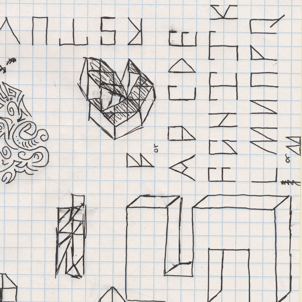
The author of Cube of Life, Douglas Connard, created this typeface in his undergraduate program at the University at Buffalo. The discovery of the grid came out of interest for found objects in his college dorm room. The ‘grid’ was an unsolved Rubik’s Cube that had sat on his dresser collating dust after many frustrating attempts. In the cube’s time spent sitting on the dresser as well as the rigid shape and sides of it, there existed a deep stillness, a feature that Doug wanted to see in his new typeface.
The beginning of bringing life to the cube was playing with the angle and perspective of the grid in relation to the viewer. At first, the result wasn’t what he was looking for; he pushed the idea so that the letter-forms could exist as more than cubes with squares on them. He ‘activated’ the cube by attempting to solve the puzzle and playing with perspective even more, allowing more movement to emerge in its shapes. By doing this, it brought upon the questions of, “When will it be finished?”, “Is it ever possible to solve?”


Personality of the Cube
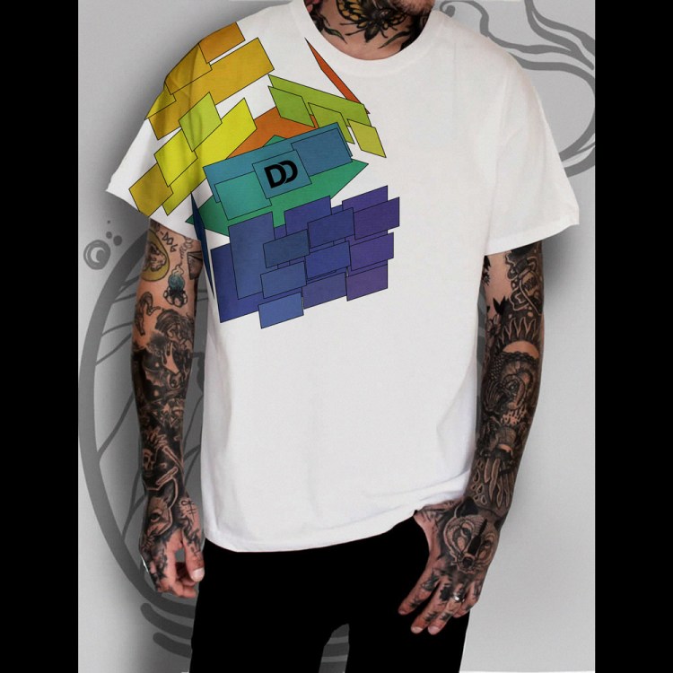
While the Cube of Life typeface may be less diverse in its possible uses, the author sees it as more of a display typeface rather than a typeface for paragraphs. It works more with legibility than readability because it exists as more abstract than traditional. This typeface works best when paired with a sans serif typeface because of the points and irregularities in Cube of Life. The letterforms have sharp, jagged, geometric qualities, relating it more to an edgy, technological setting.
This typeface could be seen in more modern or contemporary works, with a sense of seriousness yet playfully punk. Cube of Life would appear beautifully printed onto clothing, product packaging and posters or advertisements. It could also be very well seen in cyber themed or video game related materials.

Inspiration
Found objects in his college dorm room. Landing on the Rubik’s Cube.

Strategy
Using a single grid, with two groups of three different angle of the grid.

Future
This typeface is available by contacting me.
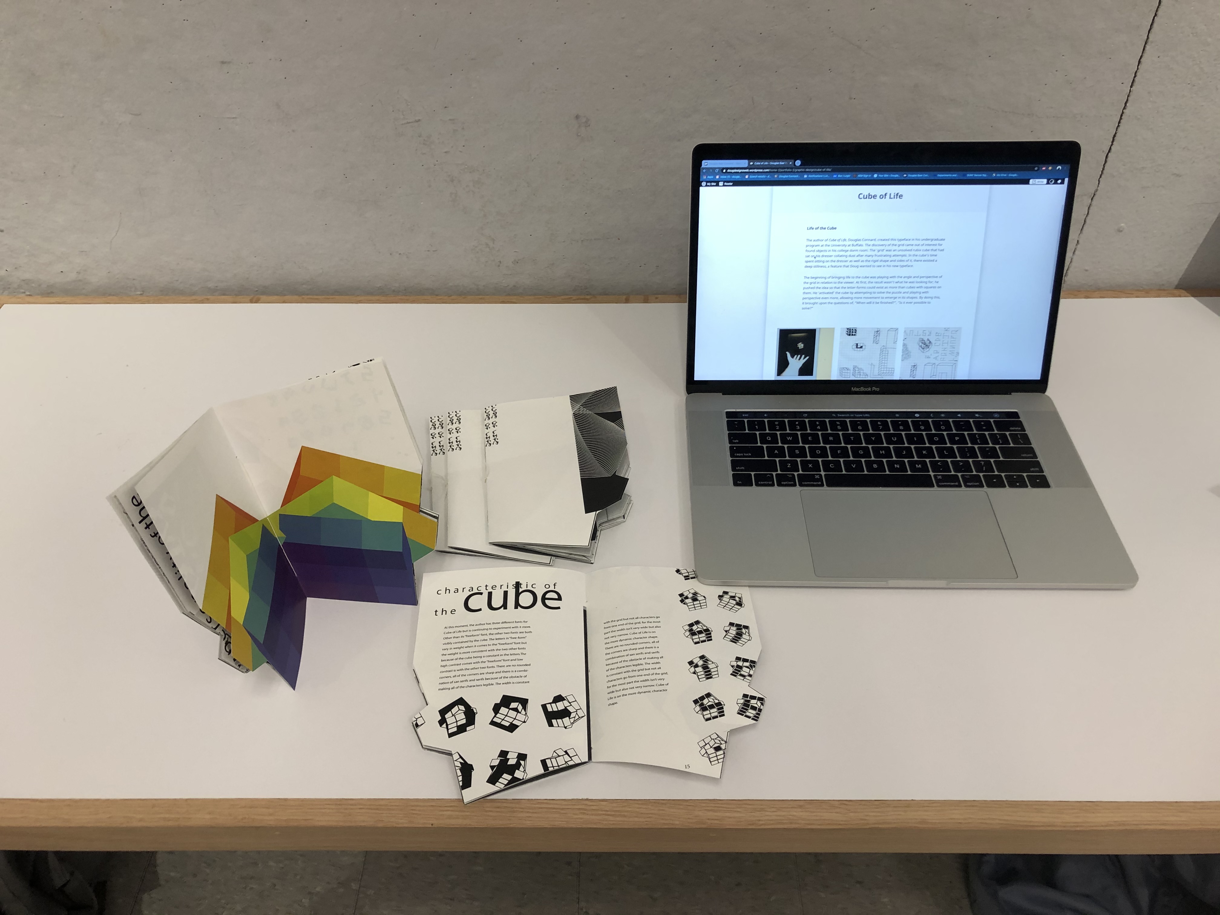
Characteristic of the Cube
At this moment, the author has three different fonts for Cube of Life but is continuing to experiment with it more. Other than its “freeform” font, the other two fonts are both visibly contained by the cube. The letters in “free-form” vary in weight when it comes to the “freeform” font but the weight is more consistent with the two other fonts because of the cube being a constant in the letters. The high contrast comes with the “freeform” font and low contrast is with the other two fonts.
There are no rounded corners, all of the corners are sharp and there is a combination of san serifs and serifs because of the obstacle of making all of the characters legible. The width is constant with the grid but not all characters go from one end of the grid, for the most part the width isn’t very wide but also not very narrow. Cube of Life is on the more dynamic character shape.
Branding
Paired with the typeface, I created a multi colored cube that can accompany the typeface.

Focus
Create an experimental typeface while challenging my design skills.
Showing